Mastodon normalizer: Difference between revisions
Improve introduction |
→Experimenting with normalization: Refine text |
||
| (15 intermediate revisions by the same user not shown) | |||
| Line 1: | Line 1: | ||
{{Project|status= | {{Project|status=demo|url=https://normalizer.webflux.us/|source=https://gitlab.com/adamwight/mastodon-normalizer}}'''Problem statement:''' Social media amplifies the loudest voices more than is necessary. In real life, we know that a person who speaks often and loudly might be full of good insights, or they might just suffer from an excess of hot air. Either way, we aren't obliged to give this person all of our attention just because they're loud. | ||
There is rarely any way to deal with this, no alternative between full volume and blocked, to allow us to better hear the quieter voices. | |||
== Experimenting with normalization == | |||
[[File:Preferences for normalizer v0.2.7.png|thumb|Preferences pane]]When @futurebird@sauropods.win mentioned the fun idea of a [https://sauropods.win/@futurebird/109971101661561998 customizable timeline] allowing us to check in on our friends' latest posts, I was excited to see how it might be applied. I'm happy with the results so far! You can login to the [https://normalizer.webflux.us/ demo service] using your own Mastodon account and instance, or try out the [https://normalizer.webflux.us/help guided tour] as a guest. | |||
= | Preferences currently look this this.<div style="clear: both;"></div> | ||
[[File:Equal height.png|right|thumb|Equal height for each author]] | |||
The default view is called the "orthogonal" view, which gives each author '''equal vertical space''' in your timeline regardless of how many posts they write or how big their attachments. | |||
A more extreme version of this view is the "Check in" mode which shows only one post from each account. This can be seen as a normalization of both vertical and horizontal space. | |||
<div style="clear: both;"></div> | |||
[[File:Normalizer with focused row.png|thumb|Focused and expanded row]] | |||
Clicking on a row of posts will expand and focus. To expand all posts by default, choose the "natural" row height preference. | |||
= | <div style="clear: both;"></div> | ||
== Time dimension == | |||
[[File:Time axis.png|right|thumb|Time axis]] | |||
If we reintroduce the timeline but with its axis tipped by 90 degrees, we can list all of each author's posts as an isolated strip running from left to right. | |||
<div style="clear: both;"></div> | |||
== | == Development == | ||
So far, this software is the labor of one unpaid person acting on friendly suggestions. Contributions, suggestions or other resources are welcome! | |||
* [https://terhech.de/ebou/ Ebou by Benedikt Terhechte] ([https://github.com/terhechte/Ebou source code]) shows a timeline with a single card for each user, and clicking on a user expands their timeline into a new column. Looks very active as of August 2023. | Its architecture is a server-side, Elixir [https://hexdocs.pm/phoenix_live_view/welcome.html Phoenix Live View] application which updates the user's browser by sending HTML over a websocket. It's authenticated temporarily to act as the user. Posts and tokens are kept in server memory and kept as state for the session, then forgotten on close. | ||
In the long term, user algorithms will ideally be visually- and script-programmable, and shareable. | |||
== Resources == | |||
=== Get involved === | |||
* Try out the [https://normalizer.webflux.us demo site]. | |||
* Read and install the [https://gitlab.com/adamwight/mastodon-normalizer source code]. | |||
* Write to @a@social.wikimedia.de | |||
=== Similar projects === | |||
* [https://terhech.de/ebou/ Ebou by Benedikt Terhechte] ([https://github.com/terhechte/Ebou source code]) ([https://sauropods.win/@h_albermann@mastodon.social/109972305658551708 highlighted] by @h_albermann) shows a timeline with a single card for each user, and clicking on a user expands their timeline into a new column. Looks very active as of August 2023. | |||
* Bluesky's [https://blueskyweb.org/blog/7-27-2023-custom-feeds "marketplace of algorithms"]. | |||
=== Reporting related to the topic === | |||
* Young, Nora (2023-09-08). [https://www.cbc.ca/radio/spark/eurpoe-digital-services-act-julia-angwin-1.6960911 "As EU law hopes to rein in Big Tech's algorithms, this reporter wants a 'third path'"]. [https://www.cbc.ca/radio/spark Spark]. Retrieved 2023-09-11. | |||
Latest revision as of 21:02, 19 July 2024
Project link (demo):
https://normalizer.webflux.us/
Source code:
https://gitlab.com/adamwight/mastodon-normalizer
Problem statement: Social media amplifies the loudest voices more than is necessary. In real life, we know that a person who speaks often and loudly might be full of good insights, or they might just suffer from an excess of hot air. Either way, we aren't obliged to give this person all of our attention just because they're loud.
There is rarely any way to deal with this, no alternative between full volume and blocked, to allow us to better hear the quieter voices.
Experimenting with normalization

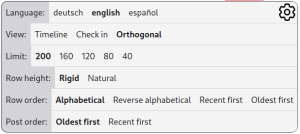
When @futurebird@sauropods.win mentioned the fun idea of a customizable timeline allowing us to check in on our friends' latest posts, I was excited to see how it might be applied. I'm happy with the results so far! You can login to the demo service using your own Mastodon account and instance, or try out the guided tour as a guest. Preferences currently look this this.

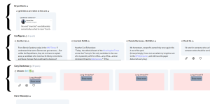
The default view is called the "orthogonal" view, which gives each author equal vertical space in your timeline regardless of how many posts they write or how big their attachments.
A more extreme version of this view is the "Check in" mode which shows only one post from each account. This can be seen as a normalization of both vertical and horizontal space.

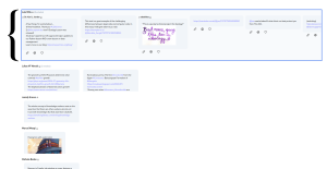
Clicking on a row of posts will expand and focus. To expand all posts by default, choose the "natural" row height preference.
Time dimension

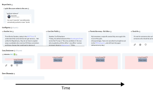
If we reintroduce the timeline but with its axis tipped by 90 degrees, we can list all of each author's posts as an isolated strip running from left to right.
Development
So far, this software is the labor of one unpaid person acting on friendly suggestions. Contributions, suggestions or other resources are welcome!
Its architecture is a server-side, Elixir Phoenix Live View application which updates the user's browser by sending HTML over a websocket. It's authenticated temporarily to act as the user. Posts and tokens are kept in server memory and kept as state for the session, then forgotten on close.
In the long term, user algorithms will ideally be visually- and script-programmable, and shareable.
Resources
Get involved
- Try out the demo site.
- Read and install the source code.
- Write to @a@social.wikimedia.de
Similar projects
- Ebou by Benedikt Terhechte (source code) (highlighted by @h_albermann) shows a timeline with a single card for each user, and clicking on a user expands their timeline into a new column. Looks very active as of August 2023.
- Bluesky's "marketplace of algorithms".
Reporting related to the topic
- Young, Nora (2023-09-08). "As EU law hopes to rein in Big Tech's algorithms, this reporter wants a 'third path'". Spark. Retrieved 2023-09-11.
